CSS #3期:更平滑的阴影
代码 🔗︎
body {
  background-color: #f1cffb;
}
.business-card1 {
  background-color: white;
  width: 100px;
  height: 100px;
  margin: 20px;
  box-shadow: 0 3px 3px rgba(0, 0, 0, 0.2);
  /* 正常使用:x-offset y-offset blur color */
}

.business-card2 {
  background-color: white;
  width: 100px;
  height: 100px;
  margin: 20px;
  box-shadow: 0 1px 1px rgba(0, 0, 0, 0.03), 0 2px 2px rgba(0, 0, 0, 0.03),
    0 4px 4px rgba(0, 0, 0, 0.03), 0 8px 8px rgba(0, 0, 0, 0.03),
    0 16px 16px rgba(0, 0, 0, 0.03), 0 64px 64px rgba(0, 0, 0, 0.03);
  /* 通过等比数列,调整y-offset和blur,将投影分层,获得更平滑和真实的阴影效果 */
}


/* 离界面越近的元素:模糊值越小,x/y-offset越小;越远则越大 */
<!DOCTYPE html>
<html style="height: 100%">
  <head>
    <meta charset="utf-8" />
    <link rel="stylesheet" href="./styles.css" />
  </head>
  <body style="height: 100%; margin: 0">
    <div class="business-card1"></div>
    <div class="business-card2"></div>
  </body>
</html>
效果 🔗︎
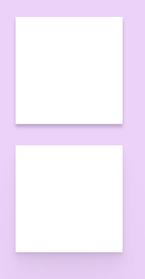
效果展示